Veröffentlicht am

Grimm4Geeks

Am 28. September 2023 habe ich beim Text+ Plenary mit dem Motto „Connecting People and Data“ in Göttingen ein Poster von meinem neuen Projekt vorgestellt: Grimm4Geeks. In dem Projekt möchte ich erforschen, wie sich die Märchentexte der Brüder Grimm auf Basis syntaktischer und semantischer Textmerkmale „illustrieren“ lassen. Hier das Poster:

Veröffentlicht am Schreib einen Kommentar

Visualizing PSYCHO*

In March 2013 I generated three short clips based on Hitchcock’s PSYCHO (1960): PSYCHOMEAN, PSYCHOMEDIAN and PSYCHOMODE (I labelled them PSYCHO*; have a closer look here). In a first step of this artistical research project I analyzed the mean, median and modal grey values of each frame of the famous shower sequence (5775 frames); in a second step I re-ordered all these frames in ascending order.

Visualisierung_klein

What I did today in the afternoon is much more unspectacular but gives surprising insight into the inner structure of the original montage as well the three different re-montages of the original image material. I put all frames together in one single image with help of ImageMontage, a plugin for ImageJ developed by Lev Manovich and his NY based team. As a result I got four visualizations that show each clip’s frames organized in a rectangular 2D grid. Great advantage of this kind of visualization is that you can catch the whole montage at a glance and grasp differences easily. See for yourself!

PSYCHO (ORIGINAL)
montage_DuscheOriginal_13350x7700_klein

PSYCHOMEAN
montage_DuscheMean_13350x7700_klein

PSYCHOMEDIAN
montage_DuscheMedian_13350x7700_klein

PSYCHOMODE
montage_DuscheModal_13350x7700_klein

Veröffentlicht am Schreib einen Kommentar

Treemaps and Art History?

Treemapping is a visualization method for displaying hierarchic structured data by using nested rectangles. This approach was firstly described in Ben Sheiderman’s essay Tree Visualization with Tree-Maps: 2-d Space-Filling Approach (1992) and offers a way not only visualizing the hierachic organised tree of data but also the content of his leaf nodes. In general, you can use treemaps as a visualization method for any kind of hierarchical data. However, if you google treemap, you’ll find a lot of treemaps showing economic data like stock prices. In this field Market Watch’s Map of the Market is a great example for the two dimensions visualized by every treemap: each rectangle’s size represents market cap and each rectangle’s color represents change in market cap.

Now I asked myself wheter that visualization method could be of interest for art history: In the last years news are over and over again about record breaking prices reached for an artwork at a public auction. Such high pricing strucks not only the old masters but also works for still living artists. As you might know the prices for young artist’s paintings are often assessed by canvas size. So the question for my use-case arises: Is there also a correlation between size and hammer price of famous artworks at auctions?

I took data of the art market in 2012 based on a survey of  Statista. Because one of the TOP 20 artworks in 2012 was Jeff Koon’s Tulips (1995-2004), a sculpture, I just took the TOP 19 artworks of 2012 for my treemap use-case. I used Treemap 4.1 developed by the University of Maryland (free for non-commerical use), put in my data structured in auction house, artist’s name, size and hammer price (-> price per square inch), and got the following treemap showing the relationship between hammer price and price per square inch:

TOP19_Zuschlagpreis_PreisproQuadratzentimeter
size: hammer price (the bigger the rectangele, the higher the price); color: price per square inch (blue: low price per square inch, red: high price per square inch)

What you can read out of that visualization is:

  • Edvard Munch’s The Scream (1885) was the artwork that reached the highest hammer price,
  • Raphael’s Head of a young Apostle (1520) reached the highest price per square inch, Munch’s The Scream the second highest price per square inch, Jackson Pollock’s Number 4 (1951) the third highest price per square inch,
  • and Sotheby’s sold the most upscaled artworks including Munch’s  The Scream, Raphael’s Head of a young Apostle and Jackson Pollock’s Number 4.

Conclusion: In 2012 a lot of artworks of still living artists reached high prices at public auctions. But putting the prices in relation to their size, you can see that age dominates over size. Hence, there seems not to exist a correlation between size and hammer price but rather between hammer price and date of origin.

Veröffentlicht am Schreib einen Kommentar

What makes a helpful visualization?

Today I would like to show that visualizing results with gephi can be helpful but that not every kind of visualization algorithm implemented in gephi matters for gaining more insight. Helpfulness depends on what you would like to show! So let’s have a closer look on my use case for that!

As you may know, I write my PhD thesis about multiscreen installations. One of my favorite examples is THE HOUSE – a work of the finnish artist Eija-Liisa Ahtila that exists in two versions: a single screen version for presentation in the cinema and a multiscreen version with three projections for presentation in the gallery or museum space. Her distribution strategy opens up a lot of questions, all about what’s the difference between the two versions.

Single screen and multiscreen version have the same length (around twenty minutes). That means if you have three instead of one screen you can show three times as much. The question raises: Which of the images used in the single screen version are popping up again in the multiscreen version? And in particular: On which screen they do that?

Kanalvergleich_Übersicht_unten_zugeschnitten

Having extracted the first scene (around one minute: 1742 frames) I came to a unique result with help of Daniel Kurzawe and his application of an automatic image recognition algorithm (that is a topic for itself – paper coming soon): Most images of the single channel version reappear on the middle screen of the multiscreen version!

Using Fruchtermann-Reingold for visualizing our result I got a visualization that shows what I would like to show:

Kanalvergleich_Fruchtermann-ReingoldThe 1742 images of the single screen version (white dots) are either connected with the left, middle or right screen node (reddish dots) or aren’t connected to anything. Left, middle and right screen node grow with the number of connecting lines. The thickness of those edges again depends on how much the images resemble to each other (that’s because of our image recognition algorithm doesn’t say similiar/not similiar but gives a degree of similiartiy).

In another way also YifanHu shows the dispersion but for my flavor it is too remindful of a bacteria culture in a petri dish:
Kanalvergleich_YifanHu2

And last but not least some other visualizations I generated with gephi that are beautiful in a special sense but don’t own explanatory power because details got lost or their alignment seems too random:


Veröffentlicht am 2 Kommentare

Visualizing Cutting Patterns

Visualizations help people to understand complex interrelations. In two of my formerly blog posts ImagePlot: Plotting Ahtila und Plotting Ahtila (… the story continues) I showed – using ImagePlot – that the finnish artist Eija-Liisa Ahtila who produced different versions of her film THE HOUSE (2002) to explore the differences between single-screen film and multi-channel installation put most of the single-screen-material to the middle screen of the 3-channel-version. Now I would like to show another way achieving that result.

In a first step I built cutting patterns of both versions. In a second step I highlighted all shots showing Elisa, the female protagonist of THE HOUSE, and all shots which are static (that means there isn’t any activity): the first ones red, the second ones blue; white coloured shots don’t show neither Elisa nor are they static. As a result you see the following at a glance: In the 1-channel-version are a lot of shots that show Elisa and only some shots which are static, in the 3-channel-version are a lot of static shots on the left and right screen; shots that show Elisa exist mostly in the middle screen – an important outcome for understanding the steering of the beholder’s view!

1-Kanal

3-Kanal

Legende

The red and blue arrows I placed in my visualization of the 3-channel-version stand for specific interrelations between shots of the left, middle and right screen which I call Zeit-Räume and Raum-Bilder. But more about that you’ll read in my PhD thesis.

Veröffentlicht am 4 Kommentare

Netzwerkvisualisierung: Daniel Kehlmanns RUHM

Daniel Kehlmanns Ruhm ist ein in neun Geschichten erzählter Roman. Ruhm lebt von den Verbindungen, den wechselseitgen Verstrickungen der jeweiligen Protagonisten: Während in der einen Geschichte die Reise des Schriftstellers Leo Richter durch Südamerika geschildert wird, handelt eine andere von dessen berühmtester Romanfigur Rosalie, die wiederum mit einer anderen fiktiven Figur, Lara Gaspard, verwandt ist. Von Lara Gaspard, deren Alter Ego Elisabeth zu sein scheint, träumt wiederum Mollwitz, ein Netzfreak und Angestellter in einer Telekommunikationsfirma, aus deren internen Intrigen letzlich die doppelte Nummernvergabe erwächst, bei der alles seinen Anfang nimmt und Ebling das Leben des berühmten Schauspielers Ralf Tanners zerstört.

Ruhm_Hauptpersonen_final_korr_Blog

Möchte man ein Netzwerk visualisieren, dann sind viele Entscheidungen zu treffen, allen voran die Entscheidung, welche Personen in die Darstellung aufgenommen werden sollen. Alle? Nur die namentlich Genannten? Oder nur diejenigen, welche die Handlung vorantreiben? Die Protagonisten? Auch diejenigen, mit denen die Protagonisten in einer engen Beziehung stehen? Man sieht, es ist unumgänglich eine präzise Fragestellung zu formulieren, um sich nicht im Detail zu verlieren. Mich interessieren diejenigen Figuren einer Geschichte, die mit Figuren einer anderen Geschichte verbunden sind, so dass jede von mir aufgenommene Figur in mindestens zwei verschiedenen Geschichten vorkommen muss. Ausnahmen von dieser Regel bilden dabei Figuren, die Brücken schlagen, wie dies z.B. im Fall von Eblings Ehefrau Elke der Fall ist, die diesen indirekt mit dem Autor Miguel Auristos Blancos verbindet, da sie eines dessen Bücher liest.

Der Name jeder Figur dient in meiner Netzwerkvisualisierung als Knotenpunkt. Den namenlosen und äußerst mysteriösen Taxifahrer‘ habe ich dabei in Anlehnung an die Forschungsliteratur zu David Lynchs Spielfilm LOST HIGHWAY, in dem ein ähnlich mysteriöser Mann, der die Fäden zu ziehen scheint, auftaucht, Mystery Man getauft. Die Schriftgröße aller Namen ist abhängig von der Anzahl der Verbindungslinien des Knotens, so dass stärker vernetzte Figuren nicht nur stärker ins Zentrum rücken, sondern auch deren Namen in einer größeren Schrift erscheinen. Um zu zeigen, welche Figur aus welcher Geschichte mit welcher Figur aus einer anderen Geschichte verbunden ist, habe ich jeder Geschichte zudem eine Farbe zugeteilt und den Figurennamen jeweils einen Kreis in der entsprechenden Farbe zur Seite gestellt, so dass man sieht, welche Figuren miteinander verbunden sind und  in welchen Geschichten sie agieren.

Das Netzwerk habe ich mit gephi erstellt, die exportierte Vektorgrafik mit inkscape nachbearbeitet und das Ergebnis schließlich als .png abgespeichert.

Veröffentlicht am 4 Kommentare

4D-Visualisierung: Geocaching

Meine Geocachingaktivitäten sind mit lediglich 36 founds in sieben Jahren nicht gerade umwerfend, aber ausreichend um den DARIAH-DE-GeoBrowser zu testen und ein nettes Anwendungsszenario zu kreieren. Jeder cache besitzt Geokoordinaten und wird bei einem Fund geloggt, so dass die beiden formalen Voraussetzungen, um mit dem GeoBrowser zu arbeiten, erfüllt sind. Meine mit dem GeoBrowser erstellte 4D-Visualisierung zeigt folglich, wann ich an welchem Ort welchen cache gefunden und geloggt habe. Mein ‚Jagdverhalten‘ mit deutlichen Aktivitäts- und Ruhephasen mit Fokus auf Wohn- und Urlaubsorte innerhalb Deutschlands wird damit sichtbar.

Geocaching


Veröffentlicht am 7 Kommentare

Wann sind zwei Bilder gleich?

Fragt man danach, ob zwei Bilder gleich sind, dann fragt man nach deren Ähnlichkeit, genauer: nach deren Identität. Zwei Bilder sind genau dann identisch, wenn keine unterscheidenden Eigenschaften festzustellen sind. Identität bezeichnet somit den Extrempunkt einer Ähnlichkeitsrelation zwischen zwei oder mehreren Gegenständen, insofern sich identische Bilder nicht nur hinsichtlich mehrerer Merkmale (Ähnlichkeit), sondern aller Merkmale gleichen (Identität). Beim Vergleich zweier digitaler Bilder besteht in der Frage nach deren Identität die Problematik, dass eine Ähnlichkeitsabweichung hier bereits durch unterschiedliche Bildgröße, Auflösung, Kompression etc. entstehen kann. Wie also lässt sich bestimmen, ob zwei digitale Bilder identisch oder zumindest ähnlich sind?

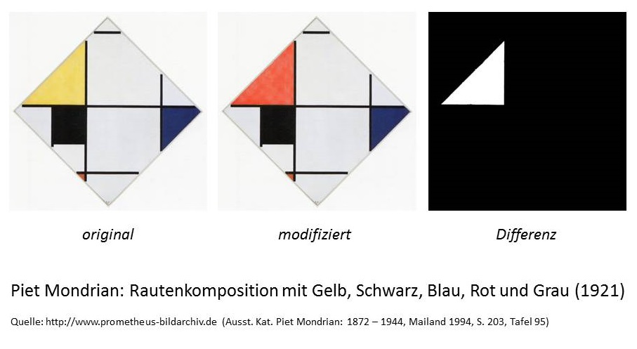
Eine Möglichkeit besteht darin, einen Pixelvergleich vorzunehmen, d.h. Pixel für Pixel zu vergleichen. Hierfür werden die beiden zu vergleichenden Bilder gleichsam übereinandergelegt: Pixel, die denselben Farbwert besitzen, werden schwarz gefärbt, die anderen weiß, so dass die Abweichung, wie das erste Beispiel zeigt, deutlich sichtbar wird. Um dieses Verfahren zu demonstrieren, habe ich ein Bild Piet Mondrians modifiziert, indem ich die gelbe Farbfläche rot eingefärbt habe. Der Pixelvergleich offenbart den Unterschied auf den ersten Blick, zeigt ein weißes Dreieck (= der modifizierte Bereich) auf schwarzem Grund (= der unveränderte Bereich).

Pixelvergleich, Beispiel 1

Pixelvergleich1

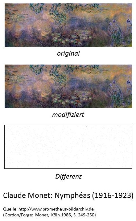
Diese Art des Vergleichs stößt jedoch sehr schnell an seine Grenzen, wie das zweite Beispiel zeigt. Hier habe ich Claude Monets berühmte Seerosen um einen Pixel nach oben verschoben, so dass das gesamte Bild auf der ursprünglichen Bildfläche um einen Pixel nach oben gewandert ist, der obere Bildrand also abgeschnitten wurde und am unteren Bildrand eine ‚leere‘ Pixelzeile entstanden ist. Mit bloßen Auge ist kein Unterschied zwischen den beiden Bildern zu erkennen, doch da aufgrund dieser Verschiebung kein Pixel mehr am selben Platz ist, liefert der Vergleich eine beinahe maximale Differenz, eine weiße Fläche mit wenigen schwarzen Punkten.

Pixelvergleich, Beispiel 2

Pixelvergleich2

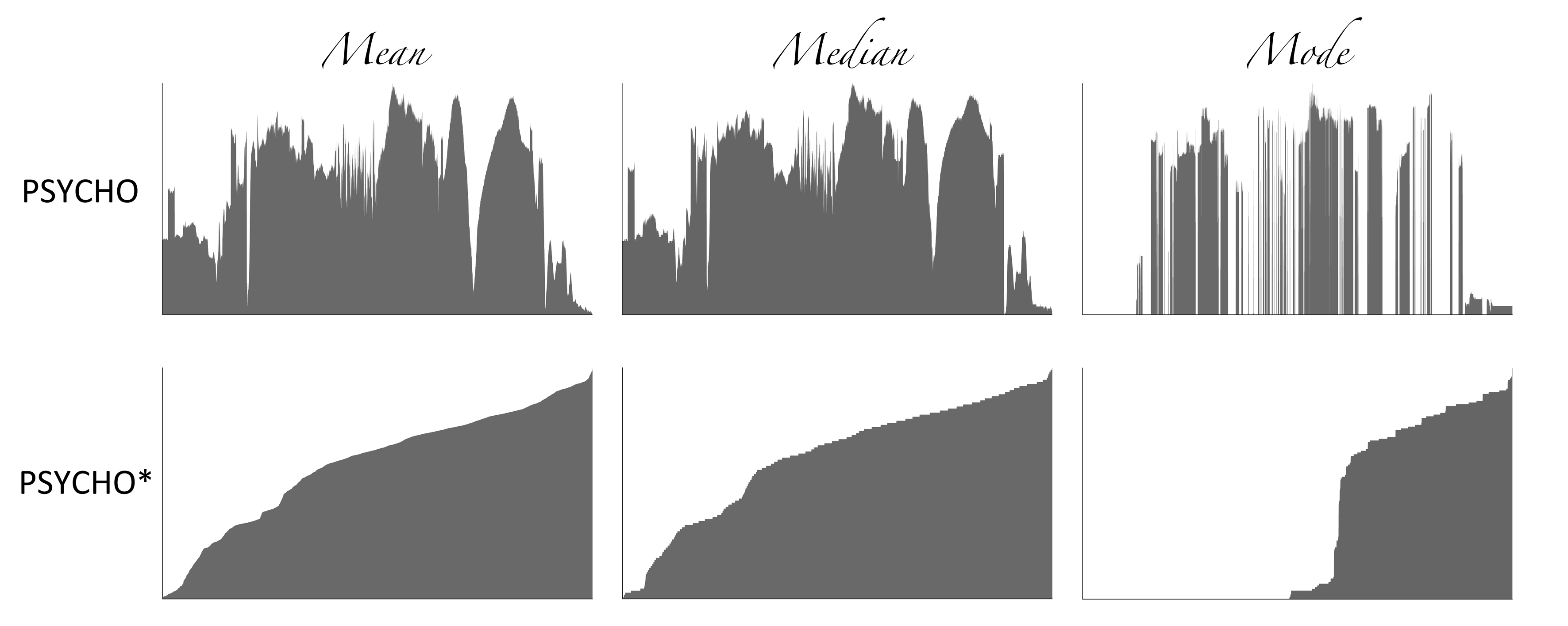
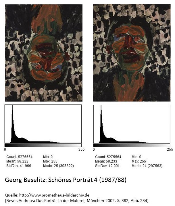
Eine andere Möglichkeit die Ähnlichkeit von Bildern zu bestimmen, besteht darin, deren Histogramme zu vergleichen. Das Histogramm eines Bildes gibt dessen Farbverteilung an, gibt also an, wie oft ein bestimmter Farbwert (RGB) oder Grauwert ((R+G+B)/3) im Bild vorliegt. Diese Verteilung kann als eine Art Fingerabdruck des Bildes betrachtet werden. Da ein Histogramm jedoch lediglich Informationen über die Farbverteilung, jedoch nicht über die Position der Bildpunkte beinhaltet, können verschiedene Bilder dasselbe Histogramm besitzen. Bilder, die gespiegelt oder gedreht wurden, werden aus diesem Grund als gleich erkannt, wie schließlich das dritte Beispiel veranschaulicht.

Histogrammvergleich, Beispiel 3
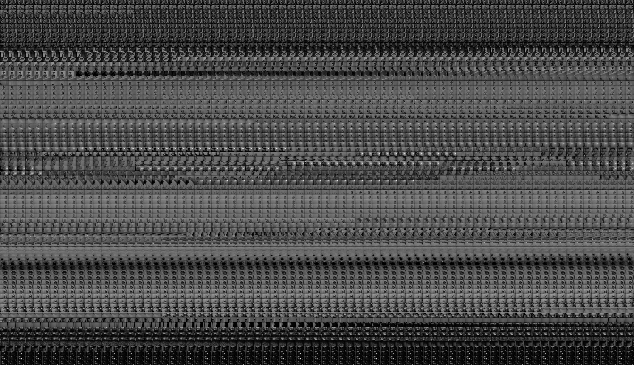
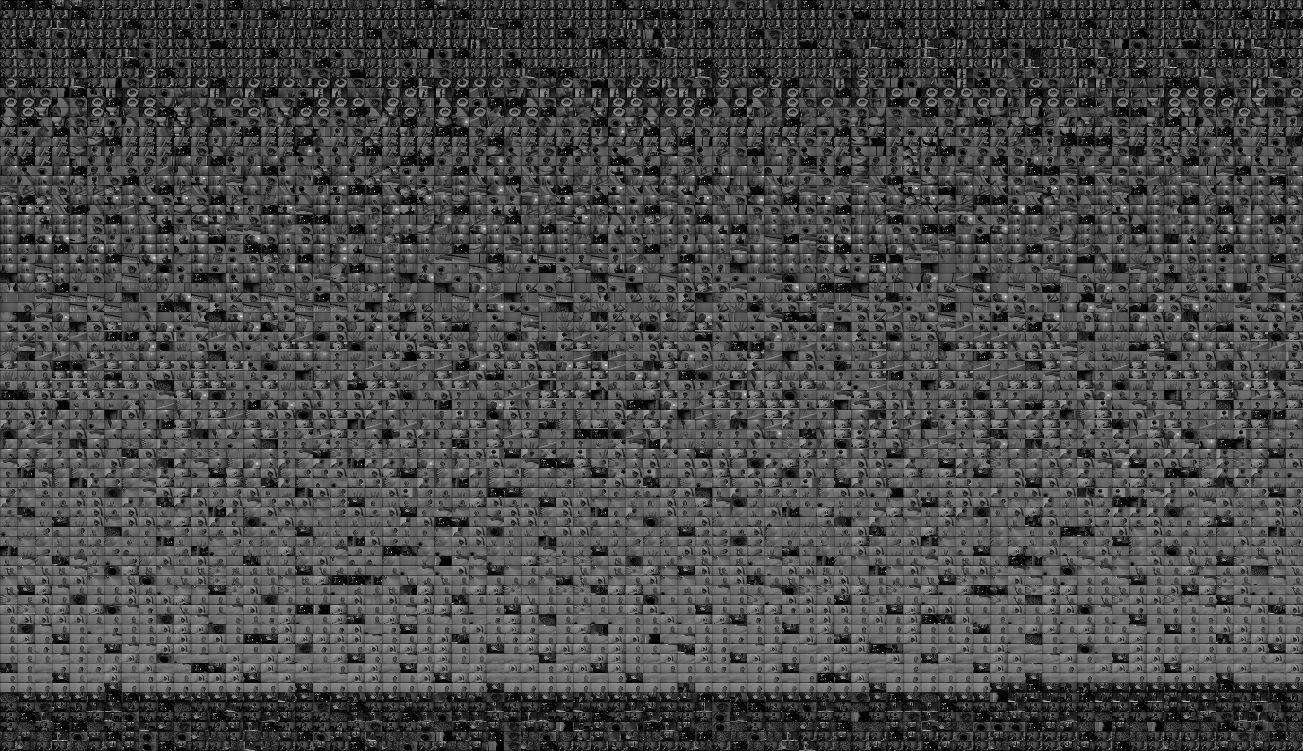
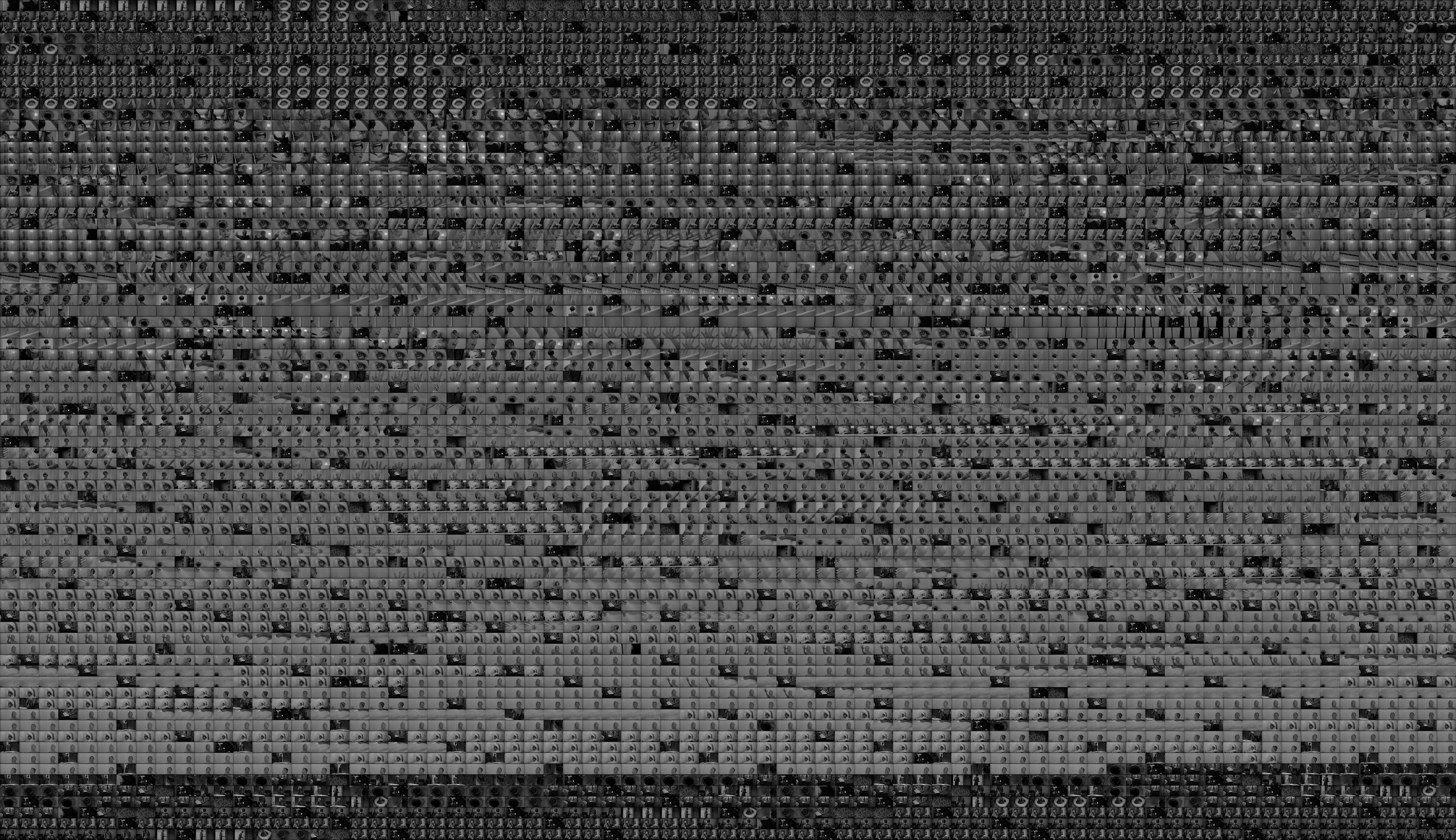
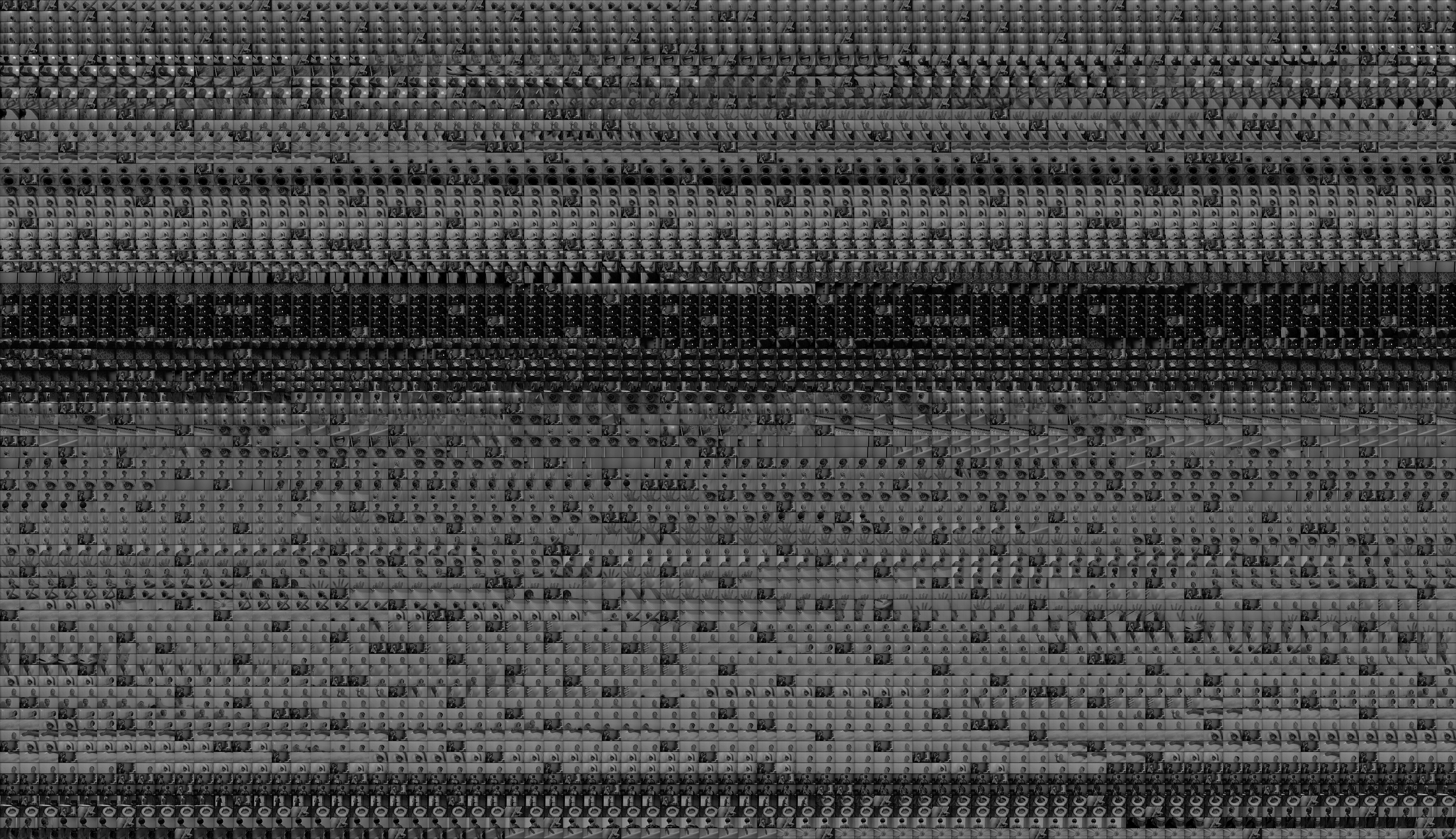
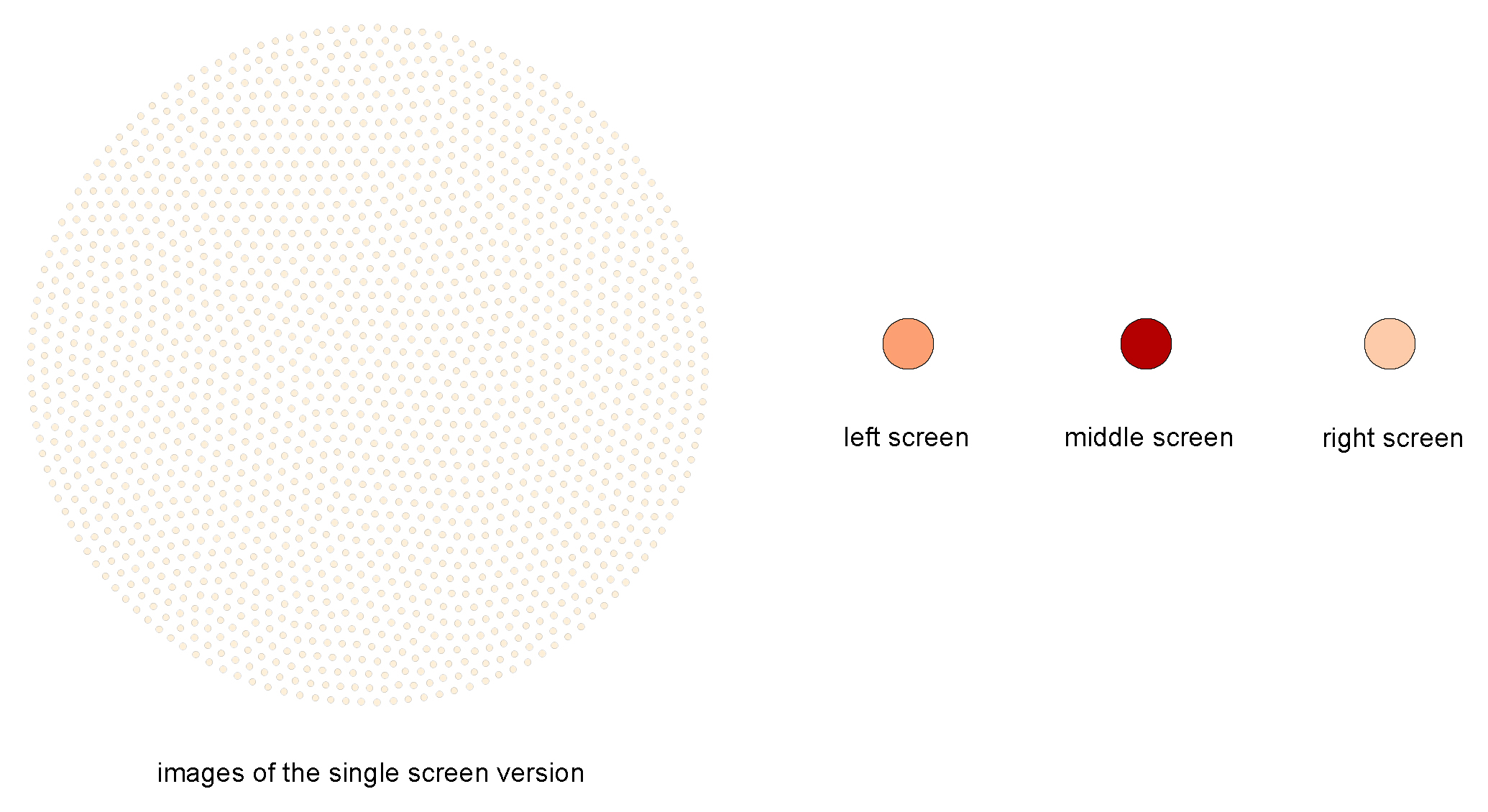
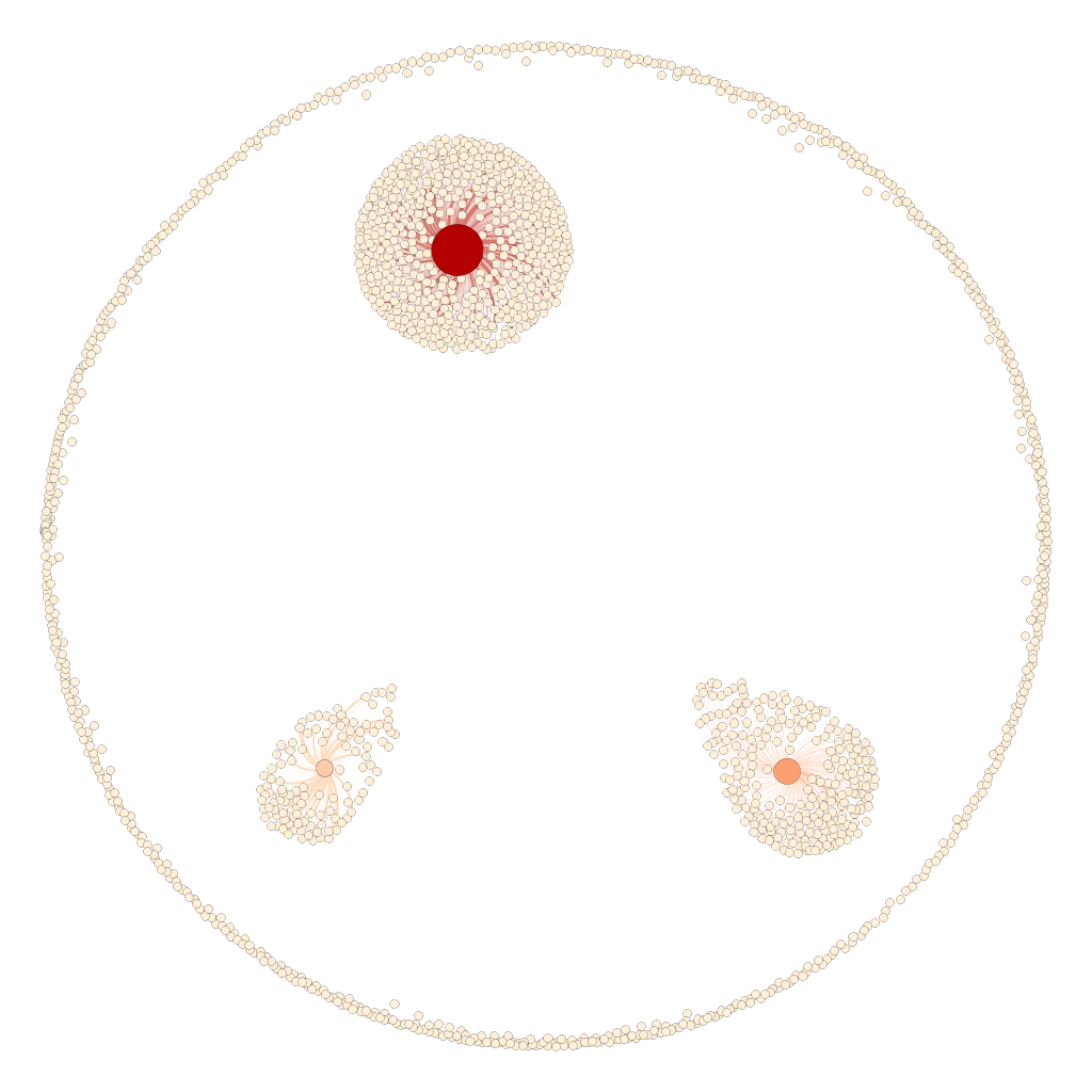
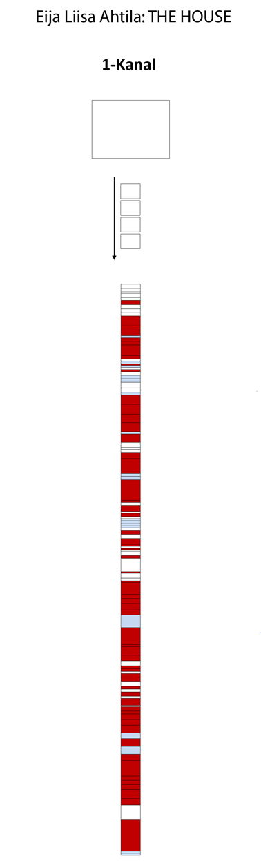
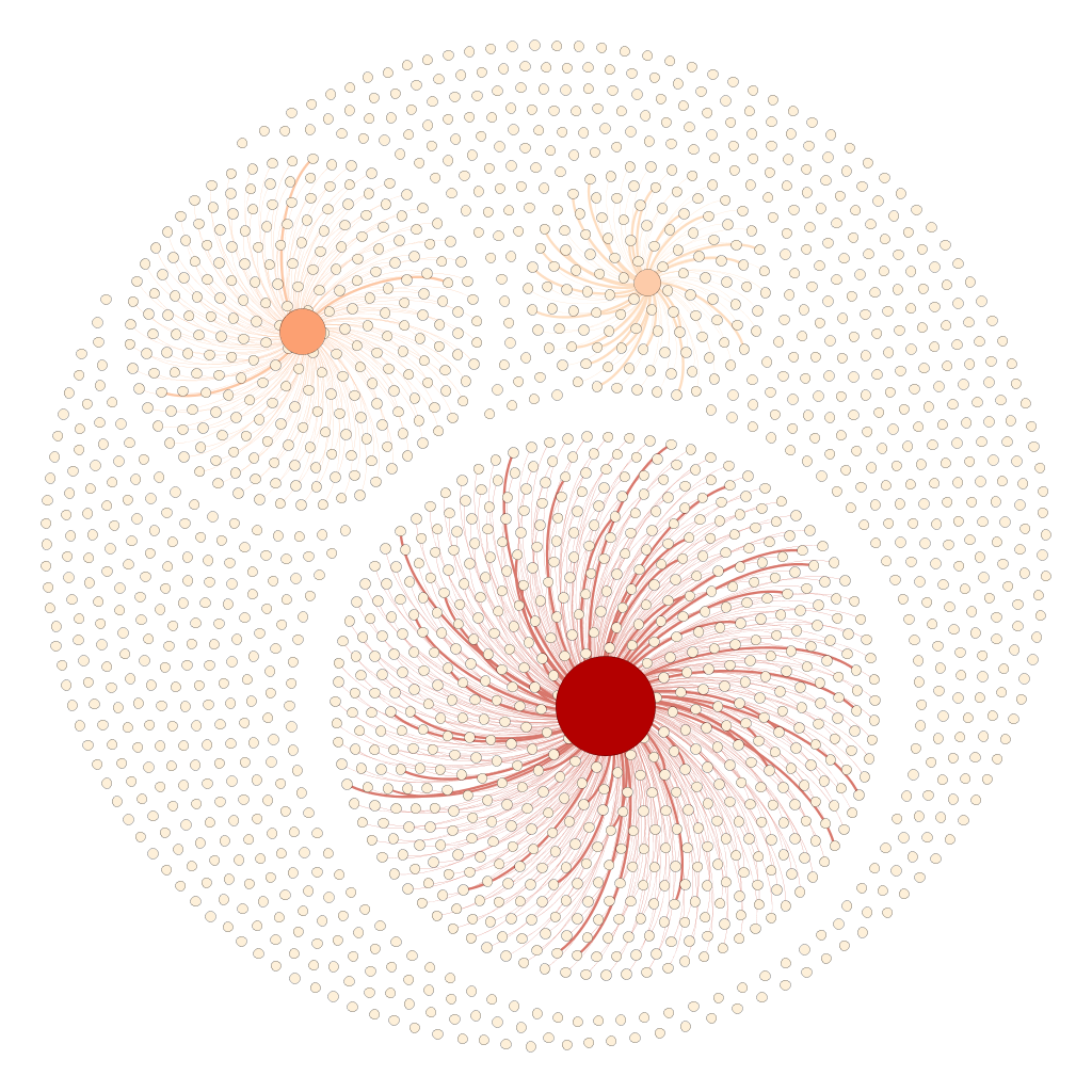
Histogrammvergleich

Veröffentlicht am 3 Kommentare

PSYCHO*

PSYCHOMEAN:

PSYCHOMEDIAN:

PSYCHOMODE:

In den Clips PSCHOMEAN, PSCHOMEDIAN und PSYCHOMODE sind die Filmbilder von Hitchcocks PSYCHO (1960) nach bestimmten bildimmanenten Prinzipien neu zusammengefügt, so dass die Montage im Ergebnis eine andere ist und eine neue Narration entsteht. Dabei habe ich mich bewusst für eine Eingrenzung auf die berühmteste Szene des Films, den Mord unter der Dusche, beschränkt, um das jeweilige Prinzip und dessen Wirkung zu veranschaulichen. Die belassene und oft asynchron zur Neumontage verlaufene Tonspur dieser Szene bildet hierbei eine Referenz zum Original.

PSCHOMEAN, PSCHOMEDIAN und PSYCHOMODE sind ein Ergebnis meiner Beschäftigung mit automatischen Bildanalyseverfahren. Ich habe mich hier dem mean gray value, dem median gray value, sowie dem mode gray value experimentell genähert, indem ich zuerst die Einzelbilder der Duschszene extrahiert und mit ImageJ (Image Processing and Analysis in Java) analysiert habe, um sie dann aufsteigend geordnet neu zusammenzufügen. Dabei hat es mich fasziniert, dass es offenbar unmöglich ist, den narrativen Zusammenhang gänzlich zu zerstören, egal, in welche Reihenfolge die Bilder gebracht werden. Um die je unterschiedliche Verteilung im Original und in den Modifikationen aufzuzeigen, habe ich in einem weiteren Schritt sechs Diagramme mithilfe von ImagePlot erstellt. Sie zeigen die Höhe des jeweiligen Wertes zu einem bestimmten Zeitpunkt der Szene an.

Visualisierung_klein

Mittel-, Median- und Modalwert gelten als die drei measures of central tendency und werden auf je andere Weise bestimmt. Interessant dabei ist, dass sich deren Werte trotz ihrer scheinbaren Ähnlichkeit unterscheiden. Dies machen die drei entstandenen Clips buchstäblich sichtbar: Der mittlere Grauwert stellt den Durchschnittswert dar, er ist die Summe der Grauwerte aller ausgewählten Pixel geteilt durch die Pixelanzahl. PSCHOMEAN ist deshalb von kurz aufflackernden Bildern geprägt. Da das Original jedoch so stark im kulturellen Gedächtnis verankert ist, sorgt die Erinnerung an die Duschszene für einen kohärenten Zusammenhang. Der Medianwert ist der mittlere Wert in einem aufsteigend geordneten Datenset. Die Kurve ist dem des Mittelwertes sehr ähnlich, im Ergebnis aber doch abweichend, denn PSYCHOMEDIAN ist weniger stark fragmentiert, einzelne Einstellungen sind wiederzuerkennen, die Bilder wiederholen sich aufgrund eines im Original eingesetzten Zooms rhythmisch. Der Modalwert schließlich ist der am häufigsten auftauchende Wert innerhalb eines Bildes. Er korrespondiert mit dem höchsten Punkt im Histogramm. PSYCHOMODE beginnt folglich mit langen Einstellungen, die jedoch gegen Ende immer kürzer werden und schließlich in ein Flackern übergehen, das den Schrecken des Mordes flashbackartig wiederzugeben scheint. Die Linearität ist in allen drei Varianten aufgehoben, ‚Vorher’ und ‚Nachher’ vermischen sich, so dass der alptraumhafte Mord als Vision oder aber paranoides Gedankenspiel Marion Cranes erscheint.

Mit diesem Experiment stehe ich in der Tradition einer Auseinandersetzung mit dem Erzählkino, gehe aber darüber hinaus, indem computergestützte Analyseinstrumentarien die Grundlage von PSYCHO* bilden. Die Auseinandersetzung mit dem Erzählkino ist eine Eigenart von Film- und Videoinstallationen wie sie seit Beginn der 1990er Jahre in Galerien und Museen anzutreffen sind. Eine bestimmte Form einer solchen Auseinandersetzung ist die des Remakes unter Verwendung von Found Footage. Douglas Gordon hat hier mit 24 HOUR PSYCHO (1993) Geschichte geschrieben. 24 HOUR PSYCHO zeigt Hitchcocks Original von 1960 verlangsamt abgespielt, auf 24 Stunden gedehnt. Inspiriert von dieser Vorgehensweise ist PSYCHO* entstanden, das als Remake eines Remakes zu verstehen ist, aber auch als Symbiose von Kunst und Technologie.

Veröffentlicht am Schreib einen Kommentar

Plotting Ahtila (the story continues)

In my last blog post I described how I explored Eija-Liisa Ahtilas 3-channel-installation THE HOUSE (2002) with ImagePlot (please see below). Ahtila is one of the artists who act not only in the art world but also in the screenland. That’s why she often produces more than one version from the same material, one multi screen version for displaying in the gallery or museum space, one single screen version for presenting in cinema. I’m sure you know I would like to get at – there’s not only a multi screen installation of THE HOUSE but also a single screen version, embedded in her portmanteau film LOVE IS A TREASURE (2002). For a better understanding of the particular potential of both presentation modes it would be interesting in which way both versions resemble each other and in which manner they differ.

Continuing my experimentation with ImagePlot, I did the same analyzes with the single screen version of THE HOUSE as I did with the single screen version before. You see the results below: The first picture shows the change of the median value (y-axis) over the film’s length (x-axis), the second shows the filled curve and the third combines both views (for this ‚combined plot‘ I manipulated the images with an image editor software).

IMAGEPLOT_INFOGRAFIK_The House_1-Kanal_klein

For comparing both versions I opposed the ‚combined plot‘ of the single screen version with the ‚combined plots‘ of the multiscreen version. In the first row of the graphic below you see the single screen version compared to the left screen of the multi screen version, in the second row you see the same compared to the middle screen and in the third compared to the right screen.

Plotting Ahtila - THE HOUSE - Comparing single and multi screen

What information can you get out of this? For me it seems that the middle screen of the multi screen version is the most similar to the single screen version. So this investigation by means of ImagePlot accounts for curator Doris Krystof’s opinion that the middle screen seems to show the main storyline:

Dabei nimmt das Bild in der Mitte insofern eine Sonderstellung ein, als man dort den Haupterzählungsstrang auszumachen meint.

– Doris Krystof (Bestandskatalog K21 Düsseldorf, Köln 2005, S. 28)

Veröffentlicht am 2 Kommentare

ImagePlot: Plotting Ahtila

ImagePlot is a visualization tool for exploring patterns in large image collections which is implemented as a macro that  runs inside ImageJ (Image Processing and Analysis in Java). It has been devoloped by the Software Studies Initiative, a research lab founded and directed by Lev Manovich. On the lab’s website there are a lot of great examples about how to gain amazing results with that tool. For instance there is a project about comparing 128 paintings by Piet Mondrian with 123 paintings by Mark Rothko in terms of brightness and saturation mean, another aspiring one is about  comparing one million manga pages. Inspired by such a kind of having a deeper look on art in a new way, commonly known as Cultural Analytics, I wondered if I could answer some of my research questions using that software tool.

Currently I’m writing on my PhD thesis about narrative in film and video installations. I’m most interested in multi screen installations, a special type of installations where artists arrange two or more screens within the gallery or museum space. To understand the specific opportunities of multiplying the projection screen for storytelling, I focus on possible graphic, syntactic and semantic relations between the single screens of a multi screen installation. Using ImagePlot I would expect to literally see some of the differences between the different screens of an installation.

My test object for exploring ImagePlot is Eija-Liisa Ahtilas THE HOUSE (2002). It’s a 3-channel-installation I’m very familiar with. Preparing this art work for processing with ImageJ I began with extracting single frames of the film (one frame per second) and went on with dividing the split screen view of the preview DVD into three separate images. After that I had three folders (left screen, middle screen, right screen) on my desktop each containing around 900 images. By means of ImageJ’s batch mode I analyzed the median value of each image. With running ImagePlot afterwards I visualized the change of the median value over time (x-axis: time; y-axis: median value).

In the graphic below you see my results of that experiment: The first row shows the results using the standard settings of ImagePlot, the second shows the result using my own settings for making the trend curve better visible, the third shows the same but with filled curves, the fourth could be understand as a bridge to the last and final graph where the slightly transparent curves of all three screens are layered to depict the differences between them.

Plotting Ahtila - THE HOUSE (3-Channel-Version)